Showing posts with label Kelly Wearstler. Show all posts

Friday, March 11, 2011

eMag: Lonny March/April 2011

Another great issue of Lonny! Check out my favorite home from this issue:


Note to self: Design a home with black floors and window frames, loads of high gloss white trim and finish with glass door knobs.  A coordinating black dog would be a plus (maybe this should be my home, since I already have the puppy).

And don't miss the article on Miss Kelly Wearstler! 


Still can't get enough of her studio. Sigh.... so fabulous.

Friday, February 4, 2011

Kelly Wearstler's Interior Design Blog

What.....?  Kelly Wearstler has a new design blog?  Craziness.


Kelly has only one post up, as of today, but it alone amazed me.  Did you know she uses trays in lieu of design boards? Genius.  Look at her amazing design studio:


Each one of those trays is a client's 'room.'  Oh to be able to peruse and take a sneak peak of the beautiful madness that is Kelly Wearstler's work.


Run, don't walk, over to Kelly's Blog.

Tuesday, January 11, 2011

Closet Case

I've had a post about closets in the works for the past week or so inspired by my New Years Resolution to 'appear' more organized.  The condition of my closet is, well, it should be an authorized state of national emergency.  It's bad.  Real bad.  I'm surprised my husband is still married to me, because it could be a valid reason for divorce.  Lucky for me the current issue of Lonny Mag is coming to my rescue! 


You would think my problem is editing, but I have no problem Good Will-ing items I haven't worn in awhile.  My problem is that I'm not utilizing all my space properly (that and I just throw my laundry every which way.  Apparently I don't know what a hanger is for).  I have about 3-4 feet above my hanging rail where I could add a system for off-season shoes, sweaters, etc.  Hmm... I wonder how long it'll take me to get around to actually organizing my closet.  Until then, let's look at some dream closets, shall we?


Doesn't the above closet remind you of Carrie Bradshaw's?  That is every girl's dream, isn't it?


Simply stunning in black lacquer.


Would you expect anything less than honeysuckle and lavender from Jamie Drake? My absolute favorite closet would have to be a tie between Rachel Zoe and Kelly Wearstler.  I'm not sure if it's the actual closet designs I'm in love with or the wardrobes they carry.  Either way, I'd take two of each!

Rachel Zoe:


Kelly Wearstler:


I must find a starburst pin like the one in Kelly's collection.  I've been on the lookout for a year or so with no avail...  let me know if you ever see one!

Monday, November 29, 2010

Starburst Mirrors

It's no secret I'm obsessed with starburst mirrors.  I have one in my living room and one over my bed... I still want more!  To me, a starburst mirror is the ultimate wall decor for the modern sophisticate.

Nickel Starburst from Global Views

Whether you are traditional, contemporary, or even rustic there is a starburst mirror for you!   Take a look at the following collection of photos to see what I mean:

Kelly Wearstler

Kelly Wearstler table accessories for Bergdorf Goodman's

Suzanne Kasler
(So much more style than if a traditional mirror was hung over the chest, don't you think?)
Suzanne Kasler
Arteriors

Metropolitan Home

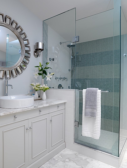
Sarah Richardson
(my dream bathroom)

Sarah Richardson
Arteriors
(The PERFECT starburst mirror, in my opinion.  I may have to purchase this before too long...)

Nickel Starburst pulls via NestInteriorDesign

Nickel Starburst pulls via NestInteriorDesign
(I really want to know their source for these.  Let me know if you know!)

Suzanne Kasler via Elle Decor
Italian Giltwood Circa 1930 via 1stDibs


Decor Pad
 Next time you have an empty space on your wall, consider adding a little polish and sophistication with a starburst!

Wednesday, November 24, 2010

{colour inspiration: scarlet, crimson & vermilion}

ravishing-reds-hed
zara-evening11

. . . have been known to wear red lipstick nearly everywhere -- on early morning walks with the dog, at the shops and in the rain, and sometimes even to the gym, but very rarely, if ever, decorate with or wear the colour red . . . and yet, somehow, and only next to gold {an all-time favourite}, shades of scarlet, crimson and vermilion, always elegant and wonderfully festive in the form of short and stylish party dresses, are perfectly and utterly irresistable at this time of year . . .


inspiration-board-red

earrings by janis savitt via gilt | yves saint laurent rouge pur couture lipstick | valentino couture bow d'orsay pump | chanel no 5 | dorothy perkins red velvet bow clips | red wine via jaipur, inverness | chanel le vernis in dragon | kelly wearstler brass kaleidoscopes

eniko-red-sequins

marion-cotillard-red-dress

{chanel no 5 via the inspiration board, red dress via a glamorous little side project; eniko mihalik by camilla akrans for vogue nippon, august 2010 via fashionising; marion cotillard by ellen von unwerth via a dustjacket attic}

Go Dark Or Not To Go Dark, That Is The Question.

I think I may have confused some readers with yesterday's post about going dark in a room, and understandably so.  There are so many different opinions about how dark one should go in a room.  Nine times out of ten, your everyday Joe will tell you to go light, which is great especially if you are concerned with re-sale value.  When a buyer is looking at your home the first thing they notice about a room is how light it is and the lighter the better!   This is why you need to paint rooms in lighter neutrals, pull open your drapes and turn on all your light sources when you show a house.  Light = Sales! (This is where builder's beige comes from.)

But what if you're not trying to sell your home?  How dark should you go?  I think it depends on a few things:

1. What kind of atmosphere are you trying to create?  Light and airy, sleek and moody, or somewhere in between?

2.  How much time do you spend in the space?  If it's a family room you spend a lot of time in during the day, you may not want to go for a dark saturated ambiance.  But a media room where you only watch movies on the weekends?  Go as dark as you dare!  Because a media room isn't a main living area, you won't grow as tired of the bold color. 

3.  What time of day do you use the room?  A breakfast nook used in the morning should be bright and cheery to welcome the new day, but if that same nook is only used to entertain guests at night, embrace the dark side! 

4. How much natural light does the room receive?  If a room has large beautiful south-facing windows I wouldn't try to compete with the sun by using dark colors or make it radio active by using bright colors.  A soft light color is appropriate here.  Recently, though, I was helping a client with a paint color for their basement hallway which had absolutely no natural light.  They were brave, took my advise and went with a dark chocolate, much to their neighbor's and painter's chagrin.  Now that it is finished, they get tons of compliments on how sharp it looks and they couldn't be happier with our choice (even the painter admitted it looked good!).   It worked because we embraced the lack of natural light and it's a transitional space where you don't spend a lot of time.  Another example, if you remember, was Katie Ridder's entryway for this year's Kips Bay Showhouse- saturated color with lots of pattern!

Despite popular belief, dark colors don't always make a little room seem tiny.  A lot of time dark colors do the opposite by diminishing boundaries, which I tried to explain in yesterday's post.  When a room is dark, it makes the objects that are not dark POP so that becomes the focus, not the boundaries.  Does that make sense?  Here's a few examples of dark rooms that POP:


Ralph Lauren Brook Street Collection

Elle Decor

Elle Decor
They key to all of these rooms is CONTRAST.  Beautiful, elegant contrast. 

A few more tips when it comes to selecting a paint color:

1. Don't be a slave to fashion trends.  Most people think they need to paint every wall in their favorite color du jour, but what they don't realize is that the walls are just backdrops to their favorite things.  So if you like turquoise, you don't have to paint your room to look like a Tiffany's gift box.  Painting your walls a charcoal or chocolate will make your turquoise drapes and lamps POP!

2. Always make a room that looks like the person living in it.  Nothing is worse than a room that doesn't feel like "you."  Your house will never feel like a home otherwise.

3.  I left this one for last because I can't stress it enough.  NEVER EVER EVER choose a paint from a chip. EVER!  Always buy testers in a variety of colors.  An easy way to do this is to take the color you think you want, then get samples in a few shades lighter and darker.  Paint LARGE swatches on your wall, live with them for a day or two and come back to them in morning light and evening light before you make your decision.  It is well worth the extra $20 in sample paint now then the extra $50-100 in paint plus labor costs for your painter or your personal time if you are a DIYer.  Here's a pic of my paint swatches I used in my Master Suite:


I ended up going with the lighter of the two swatches so my espresso stained furniture would contrast, not blend.

So do you agree with me or disagree?  Did this help clarify things or did I just confuse you more?  I'd love to hear your feedback!

P.S.  I thought I'd give you a little encore of my all time favorite dark room, Kelly Wearstler's kitchen:

My Ping in TotalPing.com